 By Michele Scism
The Results Lady
Well I went to Twitter a moment ago because I got this brilliant idea to do a short series of blog posts on things that I learn from social media sites.
Imagine my surprise when I open Twitter and get the news that there is a new Twitter layout! WooHoo! I am so excited. I am not always one for change but the first thing I notice is that the screen is wider so I can see more information at one time.
This probably means I am getting old but that little twitter screen was starting to be a little hard for me to read. Hmmmm…. OK keep that to yourself.
I love, love, love all the new info available about the tweets and who is sending them and who is mentioned in them and who is re-tweeting them. Talk about an amazing new tool to connect with the people that matter!!
OK – Now why I went to Twitter in the first place –
3 Things I Learned on Twitter Today!
1. That it's a bummer to be able to still count my money!
2. That I can create even more attention on Facebook!
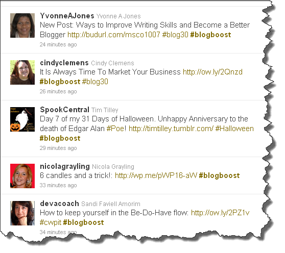
3. That there are a lot of fabulous bloggers participating in Octobers Ultimate Blog Challenge! This is just a screen shot of the #blogboost search I did.


I’m liking the “new’ Twitter, too, Michele!
And since you mentioned that little issue of the eyes having trouble focusing, just know you’re not alone. I’m older than you and I am pleased the developers created the wider Twitter screen because now it’s a hundred times easier to see everything. I’m enjoying and appreciating all the new features in this layout and it’s making for a much more enjoyable experience.
I’m a Twitterholic! 🙂
Melanie
#blogboost
LOL Awesome Terri – Hey I hadn’t thought about the custom backgrounds. It will be interesting to see how people deal with that one. I am so glad you are participating in the blog challenge too! We aren’t even a third of the way in and I am seeing great increases in traffic already. Thanks for commenting – Michele
Thanks for a great post, Michelle, and for including my tweet. I tried the new Twitter last week and do like the wider screen and more information but I’m not ‘sold’ on it yet. Have to give it another try. You know, some of us don’t like to accept changes immediately…we have to ease our way in 🙂
I would love to know how you did those screen shots because that was more than just cut and paste and it’s another beautiful way of presenting your post. Thanks.
Warmly,
Yvonne
Hey Yvonne & Sheri – I used a program called Snagit which I purchased from http://www.Techsmith.com. I think it was around $50 but well worth the investment because it makes presentations look so much more professional. Thanks for commenting. Michele
So glad you enjoyed it Cindy! Thanks for commenting, Michele